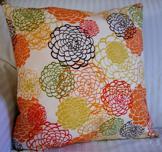
This is the front-runner, obnoxious and bright but still modern enough to not bother me:
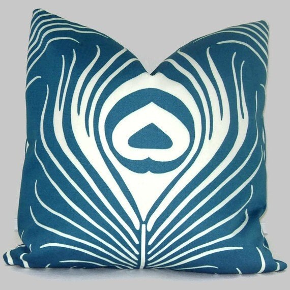
This is a little pricier than I like, I just love the color and the big peacock feather. It also comes in a gorgeous eggplant color that doesn't go with anything, sigh.
And this is totally the wrong colors for everything in my house but I adore the pattern. Somebody go buy this!

I am not changing the curtains anytime soon, so I feel like the pillow cover is a good spot for a little pop of obnoxious color. The rug will play well with most patterns as long as they have a little bit of green...
Somebody opinionated, help me!
Also, Easter roundup will be forthcoming, once I fully recover.
Edited to add: this is the room as it stands. Loosely, but the wood tones are right and the art is all correct. My curtains are lined thermal "linen" from Country Curtains or somewhere like that, they are respectable (a.k.a. not going to change) but have a very yellow tone to them (I think it's from the lining). This is what I am thinking about that nice flowery pillow to jazz things up a little bit. And leaning away from painting the walls green (I don't want it to be dark in there with all that dark wood).

5 comments:
Bright clear colours which coordinate with white, black and grey is what's on the horizon for the next five years or so. Brown, beige, all that, is going to look really dated really soon (if it doesn't already.)
What do your curtains look like? Green is a neutral in my book, so is this room going to be warm or cool?
I can see that peacock pillow working with your posters if I remember correctly.
You do those mood boards, don't you? Try that with the pillows (plus rug, curtains, furniture, posters, etc) and see how it all turns out. I would go neutral on the walls--something that goes with your wood tones--(a warm grey, perhaps? Grey comes with undertones, so you'll want to decide what you want there before you go that route.
I'm rambling. I don't suppose that was helpful?
Bright clear colors unfortunately look kind of insane in this house. That was what was killing me with painting the bedroom, even the most muted gray-blue looked clownish, like it should be in a little kid's room. There is almost no black or white, but a lot of warm neutral tones.
This house is very warm, with yellow-y "linen" curtains and cream-colored walls and orangey oak floors. None of those things are going away, despite their lack of trendiness. This house needs soft, warm colors that don't look harsh in the bright light.
A warm gray might be more in my neighborhood, but I am leaning towards the sort of creamy neutral that I already have in most of the house. Lazy, I know.
I wouldn't be so quick to call sticking with something that works, "lazy." Sometimes you just need to call it a day and move on--the "perfect" colour will come.
Your house sounds like mine--and here I thought you had all that wonderful California sunshine to contend with! But, if it's darkish, it's darkish. It was a challenge for me to come up with a "grey" that was warm--and the one I picked--Edgecomb grey--I swear is NOT grey--not where I have it, anyway.
My wall colour in my living room and dining room was picked in order to "marry" all the different wood tones--the darkish maply stuff with the yellowish oak with the espresso--so it may be worth a try at your place--its US name is Papaya. (by Benjamin Moore). Maybe a grey with a green undertone might do the trick. Do you have a BM fan deck? How about abingdon putty ((HC-99)? Anyway, it is kind of useless to suggest actuall colours this way...(but fun.)
I was thinking of a different poster when I made the above remark--and I don't see it on your mood board. The orange pillow is perfecto. It'd be dicey whether the pillow would work with the tones of the "blue" poster, too--hmmm--according to my screen--it doesn't appear to.
I'm in the market (again) for a new living room rug: any fantasy options out there to consider?
oops--the "dicey" comment refers to the peacock pillow--not the orange one. Where is that orange one from? It's gorgeous.
And obviously, I misread "harsh" for "dark." I think the cleaning fluid in the upholstery cleaner has pickled my brain. I'm slinking away now....
Post a Comment